Hi Jochen
here is the re-rendered version of the splash screen. I have also removed the highlights from the image and sharpened up the lines a little. I also made a version without the 'toon' effect, but the image becomes less dramatic. I think the outlines are realy needed.
However I can make further changes if you would like.
edd
Overview of new default textures / voting
splash screen
- Attachments
-
- title screen
-
philippeqc
- Long Poster - Project Developer - Sage
- Posts: 1526
- Joined: Mon Jul 12, 2004 8:55 am
- Location: Stockholm
- Contact:
To all who contributed, by their comments or by their sweat and labor, to the success of this operation, a big big thank you!
Edd:
Could you add, in the same font and color as "version 0.2.8.0" the text "artemis" over it, right aligned, probably top aligned with the big white "armagetron advance"?
Ok, this is not a matter of aestetic, its just a question: I've noticed that you have the text "armagetron advanced" twice, and that the blue one is a different hue than the other blue text. Care to satisfy my curiosity about your motivation? Feel free to answer with a "it just felt pretty", because I happen to agree. ;)
-ph
Canis meus id comedit.
-
Tank Program

- Forum & Project Admin, PhD
- Posts: 6714
- Joined: Thu Dec 18, 2003 7:03 pm

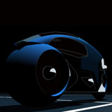
one more time.....
Thanks for the feedback.
Ph: I have added 'artemis' and removed second 'aa'. I initially thought it needed something there, and the same shade of blue did'nt look right to me, so maybe its better without it.
Tank: I have re-rendered the cycle image to a higher resolution and that seems to help, but I think I will keep tweeking it for the future release.
edd
- Attachments
-
- latest splash
-
Tank Program
- Forum & Project Admin, PhD
- Posts: 6714
- Joined: Thu Dec 18, 2003 7:03 pm
getting better!
I rendered the cycles super large and that seems to have smoothed it out a lot better. I have also changed the AA title to a larger font size and moved the version info.
All of this is on layers, so its no problem to keep changing it until we are all happy.
edd
All of this is on layers, so its no problem to keep changing it until we are all happy.
edd
- Attachments
-
- smoother!
-
Tank Program
- Forum & Project Admin, PhD
- Posts: 6714
- Joined: Thu Dec 18, 2003 7:03 pm

I'm not sure if this is where this would go, but I have 2 comments on the newly voted textures.
1. I love the new floor colour. I thought that I would prefer the blue, or even anything brighter, but I really like the dark floor.
2. I'm not a big fan of the rim wall. I'm going to have to change it. I think the style is great, but it's not very pratical for myself. I find it hard to read text with all the distraction of the walls. Even more so in Fortress where there's so much chatter. You have to try and read everything very quickly, so that you receive all the calls without having to scroll up every 5 seconds.
Also I think it was suggested somewhere that there should be a poll on whether everyone is yay or nay on the combo. I think it's probably a good idea. All the submissions were great, and the winning ones are good choices, but might not meet the needs of the game or might not work so well together.
2 pennies
This post does not come with any form of Warranty or Return Policy.
If you're unhappy with this post, please feel free to suck it up and move on.
If you're unhappy with this post, please feel free to suck it up and move on.
splash screen - re-touched
Hey Tank Program
Sorry for the delay, here is the retouched image. I have removed the yellow line and replaced it with a flat black shadow.
Edd
Sorry for the delay, here is the retouched image. I have removed the yellow line and replaced it with a flat black shadow.
Edd
- Attachments
-
- new title screen 10/02/06
ignor the previous version
I just spotted and fixed a few faults on the blue lightcycle. This is the final version.....
maybe?
edd
maybe?
edd
- Attachments
-
- final title screen 10/02/06 v2
-
Tank Program
- Forum & Project Admin, PhD
- Posts: 6714
- Joined: Thu Dec 18, 2003 7:03 pm
title screen
Thanks Tank Program,
If being a fuss pot makes it better then thats OK by me.
edd
If being a fuss pot makes it better then thats OK by me.
edd